
Dial color is easy to misunderstand in listing photos
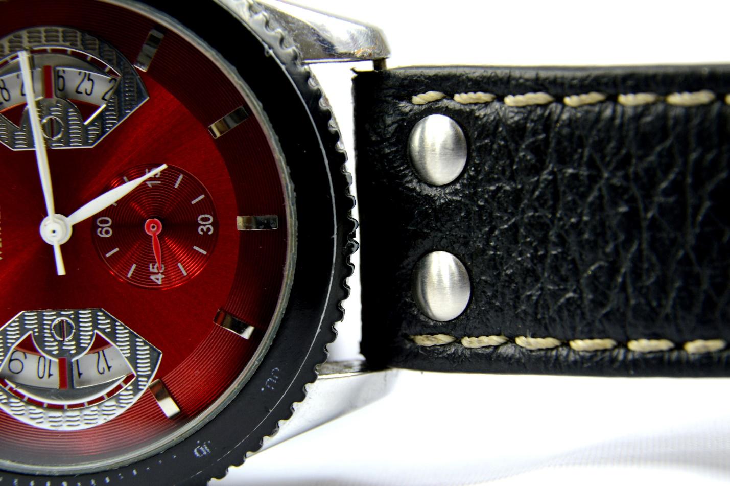
Dial color feels like the simplest thing to get right—until you actually buy the watch. If a listing says blue, green, silver, or champagne, you expect the pictures to line up with what you’ll see in real life.
Usually, they don’t.
A dial changes with light and viewing angle. Camera lenses, exposure settings, and the screen you’re staring at all shift what you think the color is. That effect jumps out on dials with metallic surfaces, sunburst finishing, and shades that live between two obvious labels.
Blue is the clearest example. In one photo, a dark blue dial can read as nearly black. In another, it looks navy and crisp. Outdoors, it may brighten and lean toward a more obvious blue. None of those images has to be “wrong.” The dial is just reacting to the light hitting it at that moment.
Green can be a bigger guessing game. Some green dials tilt olive. Others lean emerald. Indoors, deeper greens can fall so dark they barely look green at all. If you only shop off professionally lit product shots, you can end up expecting a dial that looks brighter than the one that arrives.
Silver and champagne dials add their own twist. They pick up reflections easily. Warm lighting can push silver toward cream or beige. Switch to cooler light and the same dial may look almost white.
Studio lighting shows texture, not everyday color
Photography is trying to sell the watch. That means the lighting is controlled, reflections are managed, and exposure is dialed in to make the details pop.
Good photos. Not always accurate ones.
Under several studio lights, you can see texture on the dial very clearly. Put the same watch under office lighting, and that character can fade fast. The difference is mostly about how consistent the light source is and where the reflections land.
Sunburst dials are especially sensitive. Their look shifts as light moves across the surface. In a still image, you only get one slice of that behavior. Move your wrist and the dial can darken noticeably from one angle to the next.
Short videos can fix some of this. Seeing the watch rotate gives you a better sense of how the dial responds than any single “hero” shot. Still, video isn’t a perfect guarantee.
Phones and screens rewrite the color before you even see it
Phone cameras don’t just record—they process. White balance, HDR, exposure, and saturation settings can all push the dial toward a different shade.
And that processing isn’t the same across devices.
Some phones boost saturation. Others brighten shadows or change contrast in a way that changes perceived color depth. The person filming might not realize how much the camera is doing behind the scenes.
When comparing listings across different sellers, it helps to look at the same reference in more than one place. Buyers researching super clone watches can also browse SuperCloneReps.com to compare models, dial colors, factory versions and other small visual differences that may not come through consistently in photos.
Editing can make the gap wider. A little extra contrast can make blue seem deeper. Higher saturation can make green look richer. Adjusting white balance can shift champagne and silver in a hurry.
Then the image lands on your screen, which may be bright OLED or a more muted display. Brightness, color profile, and night-mode features all influence what “champagne” or “silver” looks like to you.
No wonder people can argue about the same watch color while pointing at the same listing.
Reflections and surroundings change what the dial “borrows”
Even if the photographer tries hard, the dial is reflective. It picks up what’s around it more than most people expect.
Light from a window can tint a polished dial. Blue sky reflections can show up in metallic finishes. Warm indoor lighting can add yellow and gold tones. On a highly reflective surface, clothing and nearby objects can leave a faint imprint too.
This isn’t necessarily a seller problem. It’s just the limitation of judging something shiny through a screen with shifting lighting.
How to shop smarter when dial color is the question
Start by comparing multiple sources. Retailer photos help you see the dial clearly, but owner wrist shots often tell you more about how the color behaves in normal life.
For buyers looking beyond polished product photos, Economic Times has also covered some of the smaller watch details first-time buyers tend to miss, including finishing, movement choices and inspection points that are not always obvious from a listing.
Look for real-world light.
Wrist photos taken outdoors, in a car, at a desk, or under typical room lighting may look less “perfect,” but they usually reveal the shade you’ll actually live with. It helps to find images from different people, not one lucky angle.
If one dial looks dark in one set of photos and noticeably brighter in another, that variation is often part of the design—not proof that someone posted bad pictures.
For finicky finishes, be extra careful. Mother-of-pearl can shift dramatically with angle. Meteorite and other textured dials can behave differently for similar reasons. Even glossy black lacquer can look flatter in photos but richer in person once reflections start moving across the surface.
Also, don’t treat the official color name like a paint swatch. Brands use labels like ice blue, slate, rhodium, champagne, olive, or sunburst blue to identify the model—not to guarantee the exact shade you’ll see on your wrist.
Two people can describe the same dial differently. One might call it grey. Another calls it silver. Someone else notices a subtle blue undertone. That’s not necessarily disagreement—it’s the dial changing under different light and viewing conditions.
When it’s expensive, see it in person if you can
There’s no perfect remote solution. But you can cut down the guesswork.
Try this:
- Check photos from different sellers.
- Find owner wrist shots in natural light.
- Watch videos where the watch is moved, not just held still.
- Compare shots taken indoors and outdoors.
For a pricey purchase, it can be worth seeing a similar reference in person before ordering online. It doesn’t have to be the exact watch you buy. The goal is just to understand how that dial reads away from a screen.
Dial color feels like a minor detail—until the watch shows up and looks different than you pictured. Usually, that doesn’t mean the seller lied. More often, the photos captured one version of a dial that keeps changing.
Online images are great at showing what a watch can look like. They’re just less reliable when you’re trying to predict what it will look like every day on your wrist.